
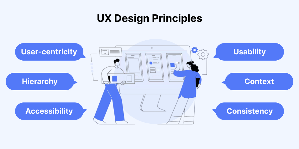
Let’s be real—UX is more than just pretty screens.
When was the last time you visited a website, got annoyed within five seconds, and just closed the tab? Probably not that long ago, right? That’s exactly why UX (User Experience) design still matters more than ever in 2025.
We’ve come a long way from static pages and clunky menus, but we still trip over the same mistakes. Whether creating a stylish app or a simple business site, avoid these common UX mistakes. I have made some of these myself.
✦ Designing for Desktops First
Let’s cut to the chase: mobile-first isn’t optional anymore.
In 2025, your users are on the move — phones, tablets, maybe even their smart fridges (seriously). If your design doesn’t flex well on smaller screens, you’re handing over your traffic to someone who did it right.
Tip: Always test your site in your own phone browser before signing off.
✦ Way Too Much Going On
You don’t need 9 buttons, 4 carousels, and a chatbot flying across the screen.
One of the biggest killers of user experience is clutter. When everything screams for attention, nothing gets it. I’ve seen websites that look like a flyer from the early 2000s. Let’s not go back there.
Less is more. Give elements space to breathe.
✦ Skipping Accessibility Like It Doesn’t Matter
I’ll admit—this used to be an afterthought for me too. Making your website usable for everyone, including people with disabilities, is not just a “bonus feature.” It is a basic requirement.
Add alt text, make buttons keyboard-navigable, use color contrast. Tools like WAVE or Axe can show you where you’re messing up.
✦ Inconsistent Design Choices
Have you ever visited a page with blue and red headings? Or a button that changes shape when you hover over it? That’s not creative; it’s confusing.
Keep your typography, colors, and layout elements consistent. Users don’t like surprises when they’re just trying to find the dang “Buy Now” button.
✦ Confusing Navigation
If it takes more than a few seconds to figure out where to go next, users leave. Period.
Don’t get too clever with menu names or hide things behind mysterious hamburger icons. And always — I repeat, always — have a search bar if you’re running a content-heavy site.
Think like your user, not like your dev team.
✦ No Real User Testing
Guessing what users want is a dangerous game. I’ve launched designs I thought were perfect, only to have users ask, “Where do I click again?”
Use tools like Maze, Hotjar, or just grab a friend and ask them to try your site. Watch their face — confusion is your signal.
✦ Tiny, Unclear Buttons (Especially on Mobile)
Let’s talk thumbs. If your button is too small to tap easily on a phone, it’s practically invisible.
General rule: make buttons at least 44×44 pixels for touch.
Also, keep the labels clear. “Submit” is boring. Try “Get My Free Trial” or “Join the Fun.” You get the idea.
✦ Slow Load Times
This one’s sneaky. You can have the prettiest design in the world, but if it takes 5+ seconds to load, no one will stick around.
Compress images, avoid unnecessary animations, and ditch those slow third-party scripts. Google’s PageSpeed Insights will be your best friend.
✦ Lack of Microinteractions
These small details make things feel real. For example, a button that changes when you hover over it. Or content that slides in smoothly when it loads.
Without them? Your site feels static. Cold. Almost lifeless.
These don’t have to be flashy — just enough to show the user “hey, something happened.”
✦ Ignoring Theme Preferences (Dark Mode, Anyone?)
It’s 2025. Some folks love dark mode. Others hate it. Why force them into one?
Giving users a simple theme toggle can seriously improve retention. Not everyone wants to stare at white screens at 2 a.m.
✦ Too Much Dependence on AI
Listen, I love AI-driven personalization. But when it becomes creepy or confusing, it kills trust.
If your AI starts recommending content or products that feel “off,” it alienates users fast. Keep some human oversight. Let people opt out.
✦ No Feedback on Actions
Ever click a button and nothing happens? You wonder — did it work? Should I click again?
Bad UX.
A quick loading spinner, a color change, or a toast message can solve this easily. Let people know their actions mattered.
✦ Forgetting Empty States
Empty states = what users see when there’s no data (like an empty inbox). Most designers ignore this. Big mistake.
Use this space to:
- Offer suggestions
- Add a touch of humor
- Guide users on what to do next
Don’t leave a blank screen and call it a day.
✦ No Real Content Hierarchy
Bold text, headings, white space — they’re not just for looks. They guide the eye.
When everything looks the same, users don’t know where to start. Create a clear visual hierarchy. Lead your users through the page.
✦ Not Keeping Up with UX Trends
Just because something worked in 2018 doesn’t mean it works now.
Voice navigation, gesture-based inputs, AR/VR elements — even if you don’t use them today, you should know about them.
Stay updated. UX is constantly evolving.
🎯 So, How Do You Avoid These Mistakes?
Easy to say, harder to do. But here’s what’s worked for me:
- Design with empathy — always think from the user’s perspective.
- Test everything, even the “obvious” stuff.
- Keep it simple, not flashy.
- Use data, but don’t ignore human feedback.
- Keep learning. UX is never “done.”
Final Thoughts
UX design in 2025 is about finding the right balance. It combines form and function, simplicity and surprise, and automation and human touch. Skip the guesswork. Design with intent. And remember — users won’t always tell you what’s wrong, but their behavior will.
FAQs
1. What’s the #1 UX mistake people still make?
Designing for themselves instead of real users.
2. How do I know if my UX is good?
Watch users use it. If they don’t ask questions or hesitate — you nailed it.
3. Is mobile UX different from desktop?
Absolutely. Different screen sizes, usage behavior, and expectations. Design accordingly.
4. Should I always follow UX trends?
Use trends as inspiration, not gospel. Stick with what works for your audience.
5. How often should I test or update UX?
Quarterly reviews are a great start, or whenever metrics dip or users complain.